VISUAL IDENTITY, LOGO DESIGN, BRAND GUIDELINES, Layout Templates
TOOLS
ILLUSTRATOR / INDESIGN / PHOTOSHOP / POWER_POINT
THE CONTEXT
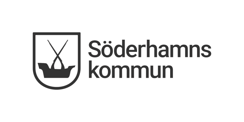
Söderhamn is a Swedish municipality that needed to modernize its visual presence. In 2019, they initiated a comprehensive rebrand to unify their communications across all touchpoints. The challenge was to create a flexible yet authoritative identity system divided into two distinct branches: one for official municipal affairs and one for destination branding. This case focuses on the primary municipal identity.
SYSTEMATIC CRAFT
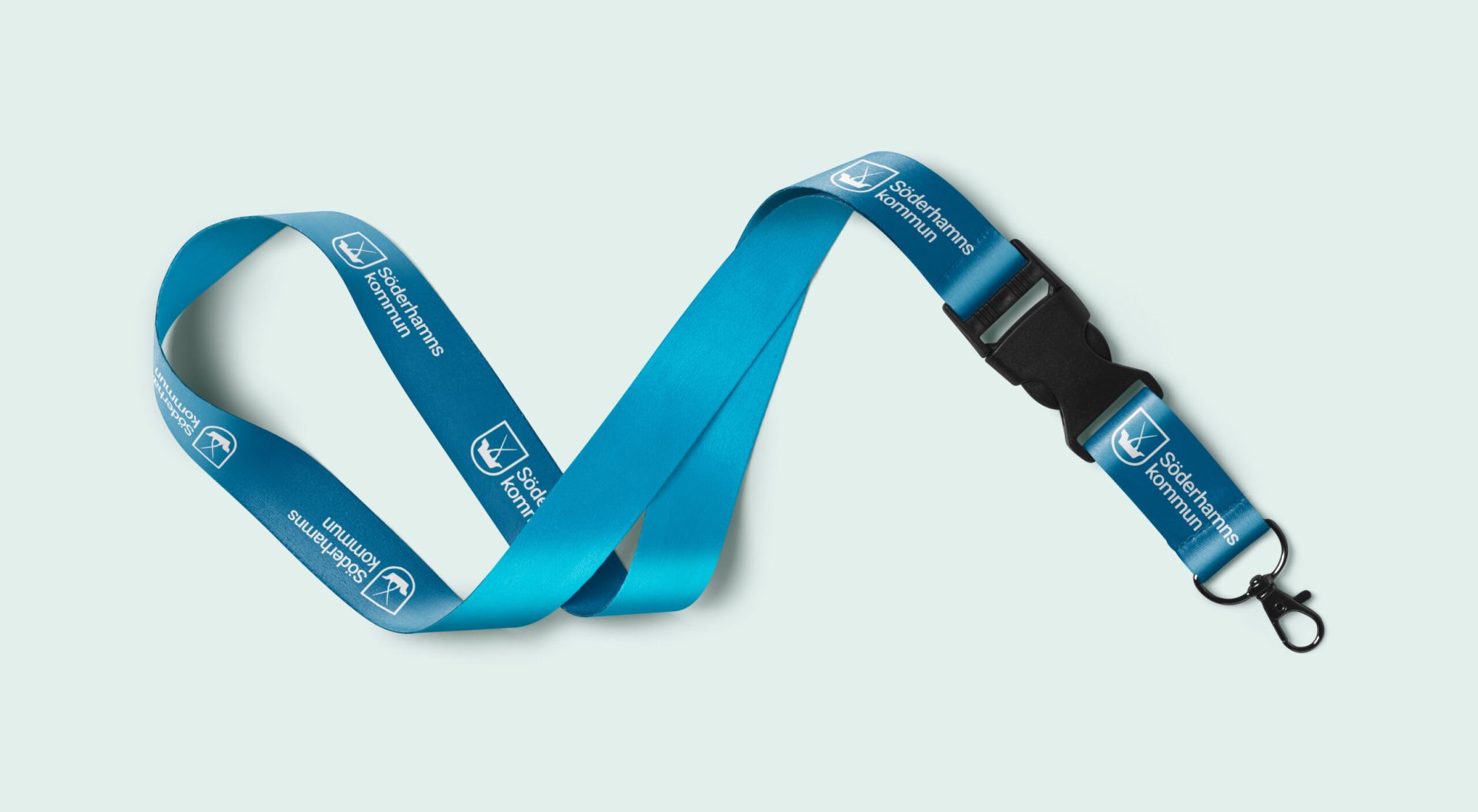
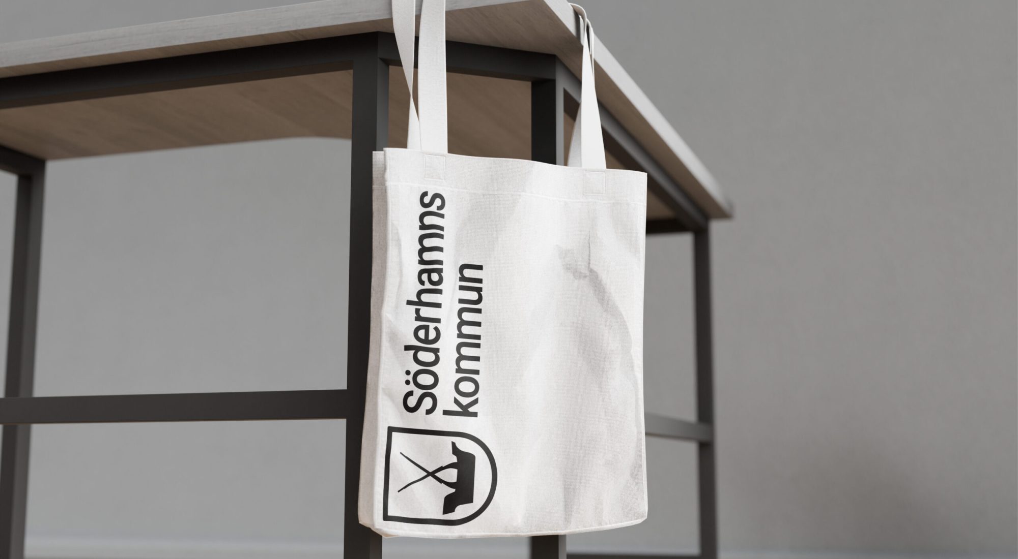
Working at the agency ’Ohana Stockholm as the lead designer, I collaborated closely with an Art Director and Söderhamn’s internal communications department. My role was to translate conceptual sketches into a fully functional, pixel-perfect brand system. I made the final logo design, defined the vibrant color palette, established the typographic hierarchy, and created grids and layouts that now form the foundation of their graphic manual.
Lead, Light 20pt – Lorem ipsum dolor sit amet, consectetur adipiscing elit, sed do eiusmod tempor incididunt ut labore et dolore magna aliqua. Ut enim ad minim veniam, quis nostrud.
Body, Regular 16pt – Lorem ipsum dolor sit amet, consectetur adipiscing elit, sed do eiusmod tempor incididunt ut labore et dolore magna aliqua. Ut enim ad minim veniam, quis nostrud exercitation ullamco laboris nisi ut aliquip ex ea commodo consequat. Duis aute irure dolor in reprehenderit in voluptate velit esse cillum dolore eu fugiat nulla pariatur. Excepteur sint occaecat cupidatat non proident, sunt in culpa qui officia deserunt mollit anim id est laborum.